
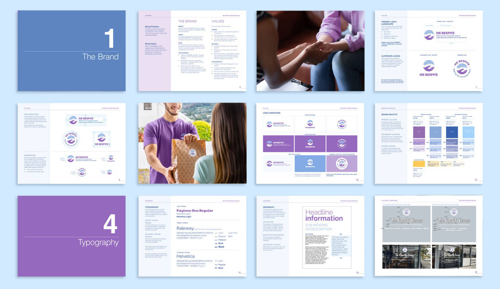
Brand Identity
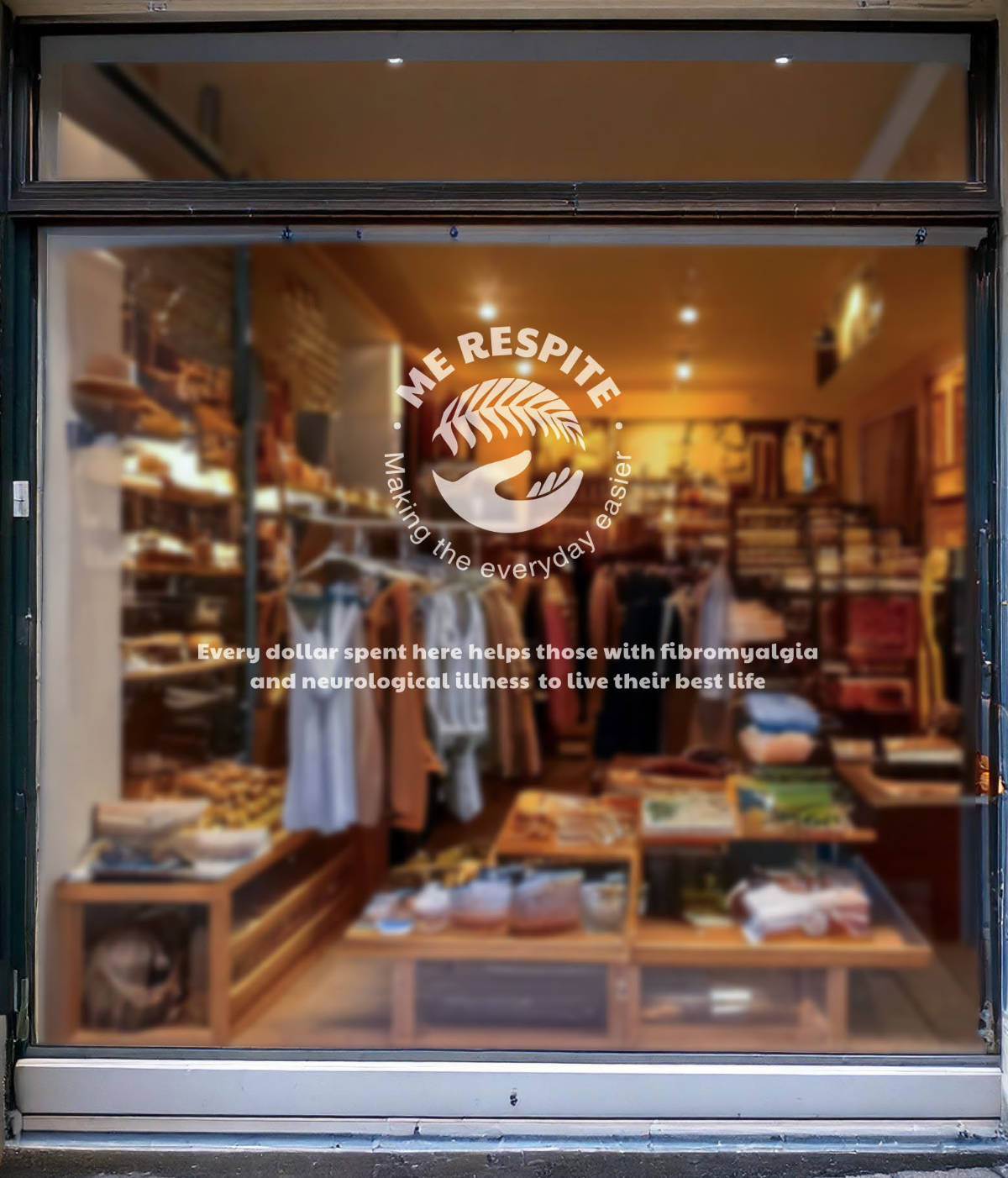
Me Respite Trust aims to support individuals in the community living with ME/CFS and Fibromyalgia through support groups, knowledge sharing, and food parcels. The charity's overall goal is to establish a respite facility for sufferers, providing them with the rest and recovery time they need in a supportive environment.
Its primary audience includes those with ME/CFS and Fibromyalgia – primarily teenagers and individuals aged 39-40. The secondary audience consists of supporters and donors – generally older individuals or family members of those affected.


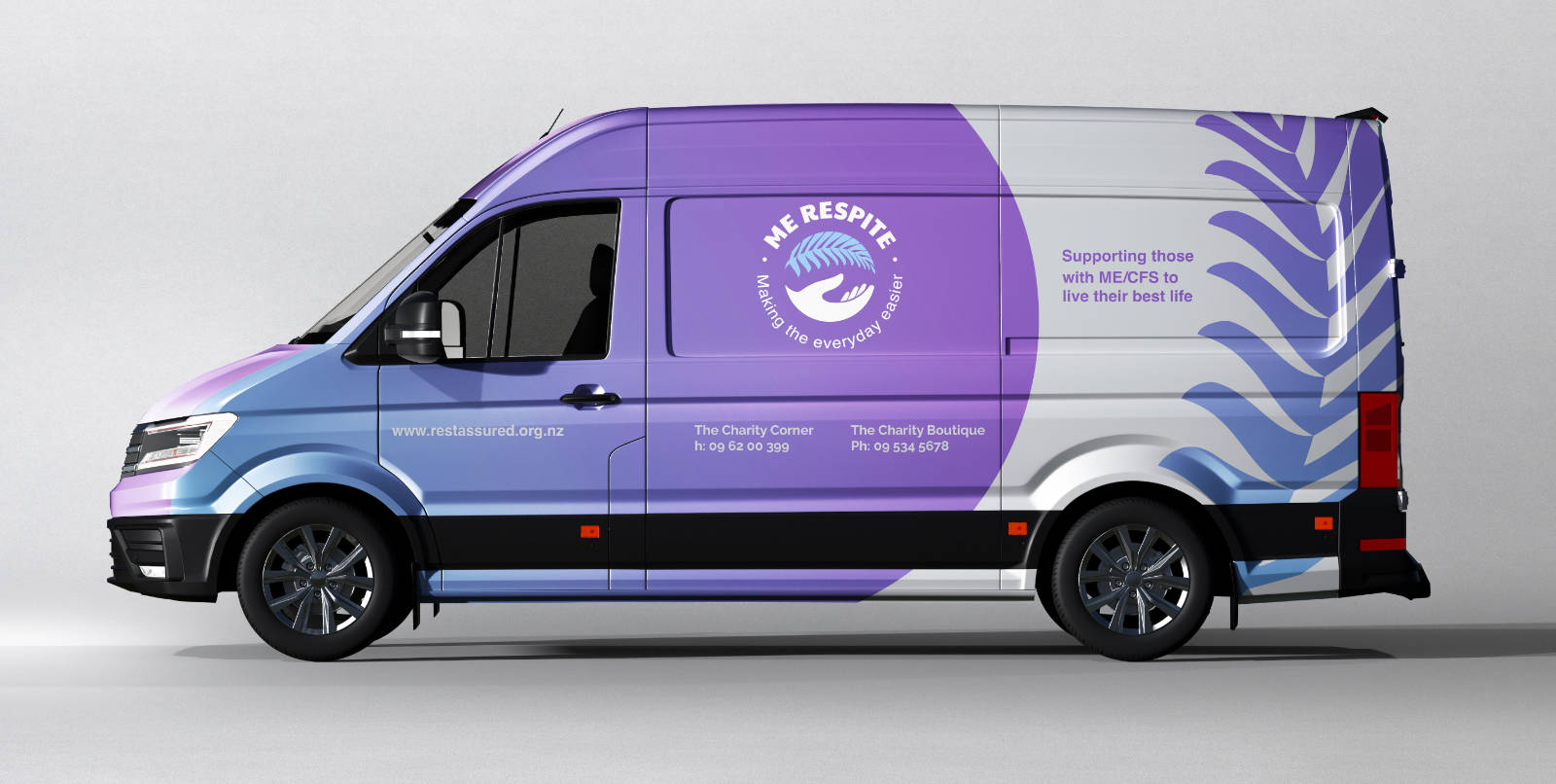
Design Objectives:The main objective of the brand identity was to bring the organisation's values to life: care, reliability, and trustworthiness, while maintaining a modern and appealing aesthetic for its diverse audience. The logo also needed to clearly communicate the brand's purpose and establish a strong association with New Zealand.
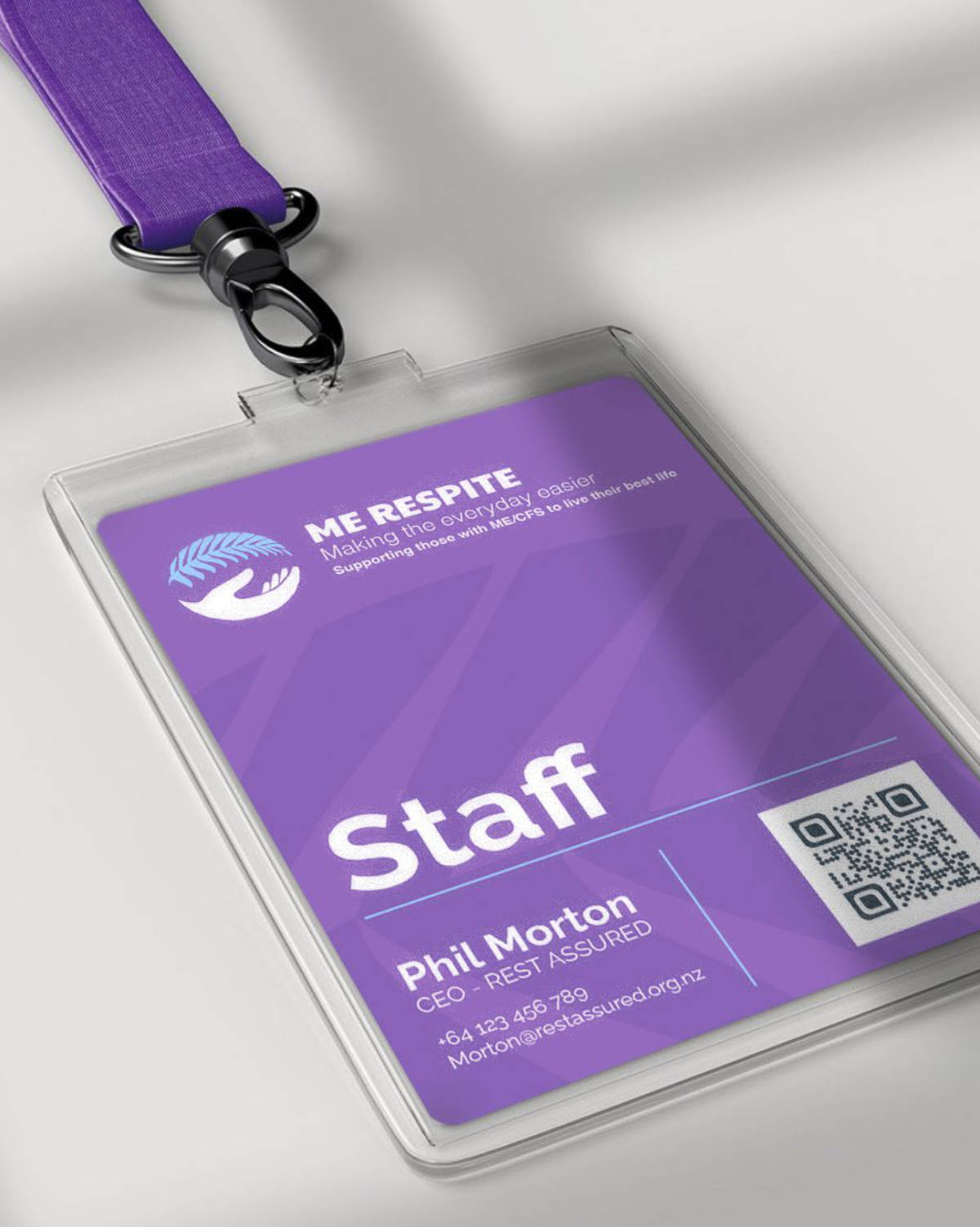
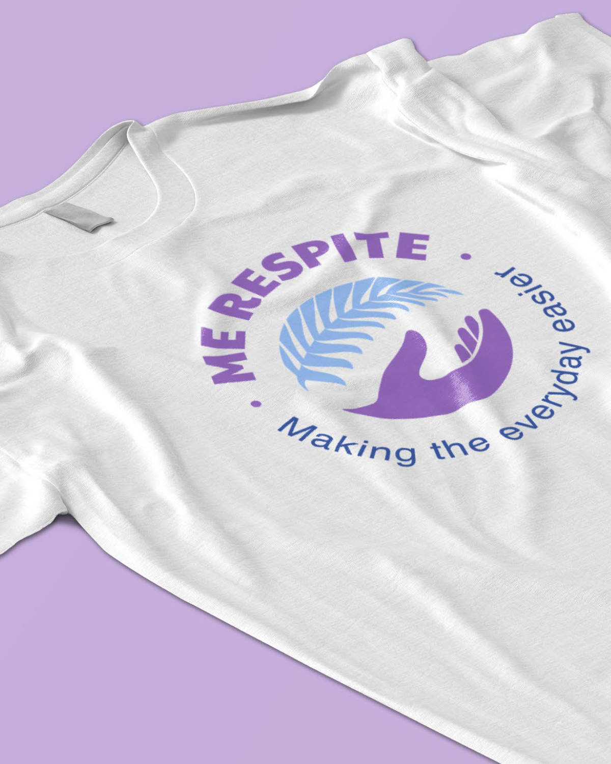
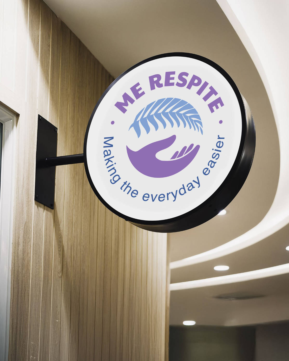
The solution features two elements: a hand at the bottom of the circle, symbolising "holding you up," which represents the brand's vision of providing help, support, and hope to ME patients.
The second element is the fern above, which serves as the other cupping hand while also acting as a symbol of New Zealand.
The graphic element provided by the client was an important reference for how they envisioned their logo

Let's work together!